Introduction to Data Visualization in Mathematics
Data visualization is an indispensable tool in modern education and research, particularly when it comes to understanding mathematical concepts. Over the years, its role has evolved from simple static graphs to advanced interactive visual models. In this article, we will explore the different methods of visualizing data that help students, educators, and researchers understand complex mathematical theories and problems. From the simple bar chart to sophisticated interactive simulations, each visualization technique serves to clarify abstract concepts, making mathematics more accessible and intuitive.
Mathematics, often regarded as an abstract and theoretical discipline, relies heavily on symbols, formulas, and equations. While these methods are essential for rigor and precision, they can sometimes hinder conceptual understanding. Visualization, on the other hand, taps into our innate ability to process visual information and offers a more tangible means of interacting with mathematical ideas. Whether it's exploring functions, geometric shapes, or data sets, visual aids bridge the gap between theory and intuition, allowing us to grasp difficult concepts more easily.
The Evolution of Mathematical Visualizations
The journey of data visualization in mathematics began with simple graphs. One of the earliest and most fundamental types of visual representation is the graph of a function. A basic Cartesian graph can convey the relationship between two variables, and even simple visualizations can help students understand concepts such as slope, intercepts, and the behavior of functions.
As technology advanced, so did the tools for data visualization. The traditional pen-and-paper graphs evolved into computer-generated images, where more complex mathematical relationships could be displayed with ease. For example, the visualization of multivariable functions, which can be quite challenging to grasp, was made possible through 3D plotting techniques. The shift from static images to dynamic, interactive visualizations marked a significant turning point in the study of mathematics.
Today, the use of interactive diagrams and simulations plays a pivotal role in education. By interacting with the graphs, students can experiment with variables in real time and observe the resulting changes, enhancing their understanding of mathematical dynamics. Interactive tools allow for deeper engagement with mathematical models, helping learners internalize complex principles through active participation.
Key Visualization Techniques in Mathematics
1. Graphs and Plots
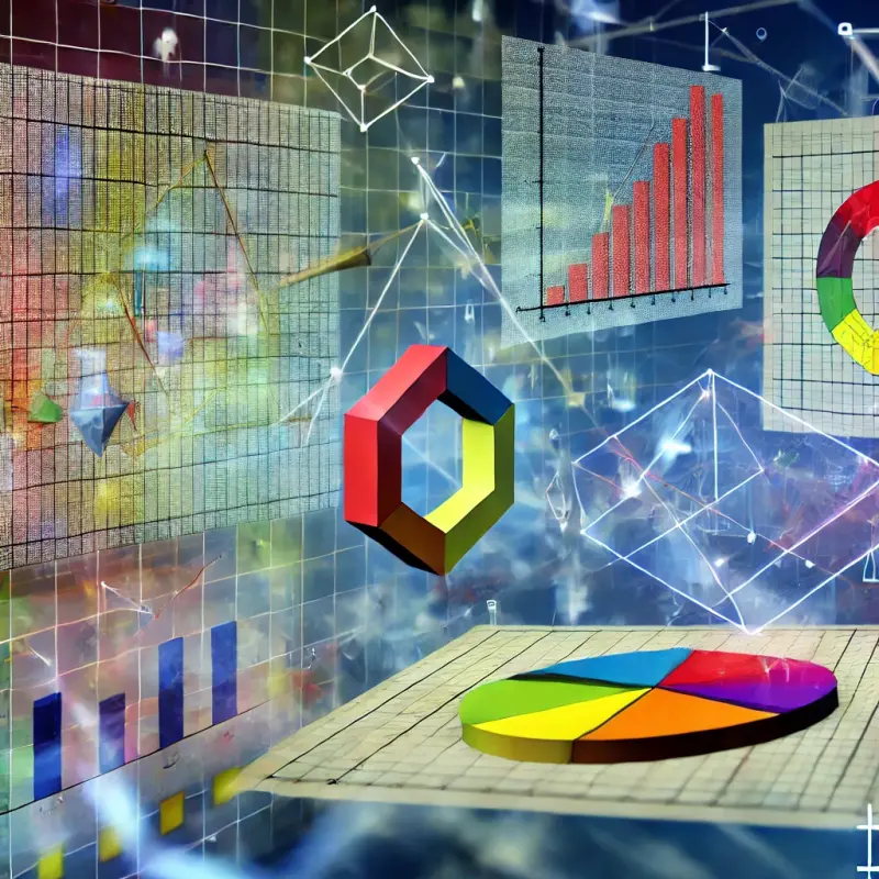
Graphs are among the simplest and most widely used forms of data visualization. They are used to represent mathematical functions, data sets, and statistical relationships. For instance, line graphs, bar charts, and scatter plots are common in algebra, calculus, and statistics. These visual representations allow students to see trends, relationships, and patterns that might be obscured in purely algebraic or numerical representations.
One of the most common examples is the Cartesian coordinate system used to graph functions. In the case of a linear function, plotting points and connecting them results in a straight line, visually demonstrating the concept of slope. For quadratic functions, the graph takes the form of a parabola, showing how changes in the coefficients of the function alter the curve's shape.
The introduction of 3D graphing expanded the scope of visualization. Functions involving three variables, such as f(x,y,z)f(x, y, z), can now be represented on three-dimensional axes. These visualizations allow for the exploration of more complex mathematical concepts, such as surfaces and solid geometry, which are difficult to understand without a spatial component.
2. Geometric Visualizations
Geometry is another area of mathematics that benefits from visual representation. Many geometric principles, such as area, volume, and the properties of shapes, become clearer when visualized. Simple 2D shapes like triangles, squares, and circles can be easily understood through static drawings, but more advanced topics like solid geometry or transformations require dynamic models.
For example, when studying the properties of a sphere or cube, students can manipulate 3D models to better understand concepts like surface area, volume, and symmetry. These visualizations enable learners to experiment with the geometry of objects, moving them around to view them from different perspectives. This ability to interact with geometric objects significantly enhances comprehension and fosters deeper insight into their properties.
3. Graph Theory and Networks
Graph theory, which deals with networks of interconnected nodes and edges, is a branch of mathematics where visualization plays a crucial role. Representing networks visually allows mathematicians to quickly identify relationships between nodes, understand the structure of networks, and identify key properties such as connectivity, cycles, and paths.
In the context of graph theory, interactive visualizations have become invaluable. By exploring networks in real time, students can manipulate edges, add or remove nodes, and observe the effects of these changes on the overall structure. These dynamic tools help learners visualize algorithms such as Dijkstra's shortest path algorithm or the traveling salesman problem, providing insights into the behavior of the graph in a way that static representations cannot.
4. Data Science and Statistics
Data science and statistics have seen a rapid increase in the use of data visualization techniques. In these fields, visualization is not only used to represent the raw data but also to interpret complex statistical relationships. Charts such as histograms, box plots, and scatter plots are essential for understanding distributions, correlations, and outliers in data.
In more advanced statistical methods, visualization becomes even more important. For example, principal component analysis (PCA) and clustering algorithms are often represented in reduced-dimensional graphs, allowing for the exploration of high-dimensional data in a way that is both comprehensible and insightful. Interactive tools for statistical analysis, such as interactive dashboards, allow users to drill down into the data, explore subsets, and gain a deeper understanding of trends and patterns.
5. Mathematical Simulations
Interactive simulations are another cutting-edge method of data visualization that has transformed the way mathematical concepts are studied. These tools allow for the exploration of mathematical models and theories in real time, making complex abstract ideas more tangible. For instance, dynamic simulations of differential equations show how the solutions change over time, offering a better understanding of the behavior of systems such as population growth, radioactive decay, or mechanical systems.
Simulations provide an immersive way to experiment with mathematical models, where students can adjust parameters and immediately see the results. This hands-on approach encourages active learning, as students can see the impact of their decisions and gain a deeper understanding of the underlying mathematical principles.